/Logo%202023%20final%20dunkelgrau.png?width=221&height=97&name=Logo%202023%20final%20dunkelgrau.png)


Dashboards are the cornerstone of sound business decisions and therefore crucial to a company's success. A well-designed dashboard provides relevant information in a compact form and reveals the current economic situation and development of the company. In a business context, the necessary information is presented in terms of key performance indicators (KPIs). Ultimately, the challenge in developing a dashboard is to present these key performance indicators in a clear and easy-to-understand manner. But what's the best way to do so? There are many options, ranging from simple numerical representations to complex charts.
Our Blog Series "Dashboarding with Tableau" at a glance
|
In the first blog of our series "Dashboarding with Tableau'', we would like to present a particularly flexible way of displaying KPIs and its technical implementation in Tableau: the Tableau KPI Tiles. In case you have read our blog article on the NextLytics SmartTile for SAP Analytics Cloud, you already know about the need to analyze key figures in context. For this reason, we are once again combining different components in a versatile KPI Tile to enable you to examine important metrics from different angles in order to draw conclusions about the overall performance.
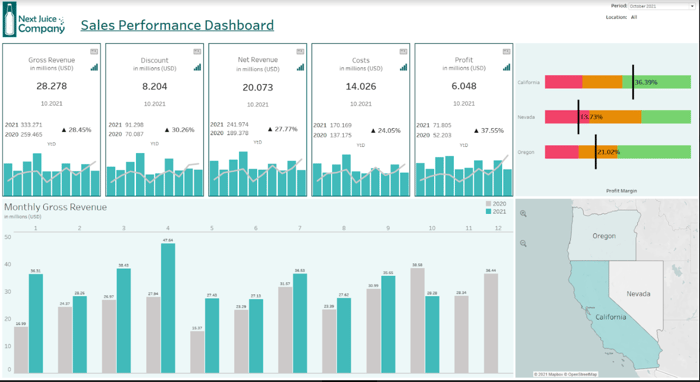
Use Case: Sales Performance Dashboard
The Tableau KPI Tile will form the centerpiece of the sales dashboard of the NextJuice Corporation, an internationally operating chain of beverage stores. By using our dashboard, senior management will be able to get the comprehensive overview of the current economic situation of the company needed to derive appropriate decisions. The main KPIs, such as revenue, costs, profit, and so forth, will each have a dedicated tile, which will provide details about the current level of the respective key figure and additional information to better assess the current values. In later posts in this blog series, we will enhance the tiles with dynamic elements that allow the manager to perform more extensive analyses.
What information is included?
The focus of our tile is the current monthly value of the key figure. However, the numerical value itself does not allow any particular conclusions to be drawn about the current business performance. In order to support the viewer in understanding the KPIs development over time, we supplement the tile with a year-to-date comparison as well as a chart that breaks down the two YtD values of the past fiscal years. Finally, we will add buttons to our tile, which will be explained in later articles.
So essentially, a single tile consists of 4 different worksheets that contain the following information:
- the current value of the KPI
- the YtD values of the selected period and the previous period
- the percentage change of the YtD value
- a chart displaying the development of the KPI over time
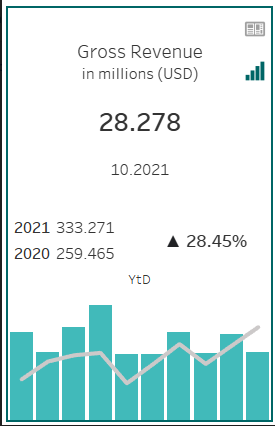
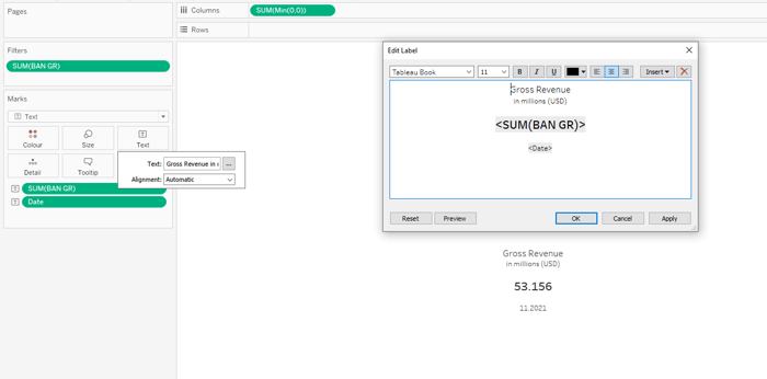
What is the current value of the KPI ?
There are various options for displaying a numerical value in Tableau. The most obvious is to place the key figure and the time dimension on the text field of the marks card and then filter to the desired month using the time dimension. After dropping the two fields in the marker card, they are available in the label editor and can be used to format the display of the KPI.
Filtering by date is a simple solution and sufficient for most use cases. However, in our case, a date filter that restricts the data by specific months would not work as supposed . For the calculation of YtD values, the selected month will be used only as a reference to sum up the monthly amounts up to that point. This will not work if the data is filtered to a specific month. For this reason, we choose another solution at this point: parameters. These serve as placeholders and are particularly useful for dynamically adjusting the values in a calculation or chart. So let's first create the parameter Period based on the Date field.
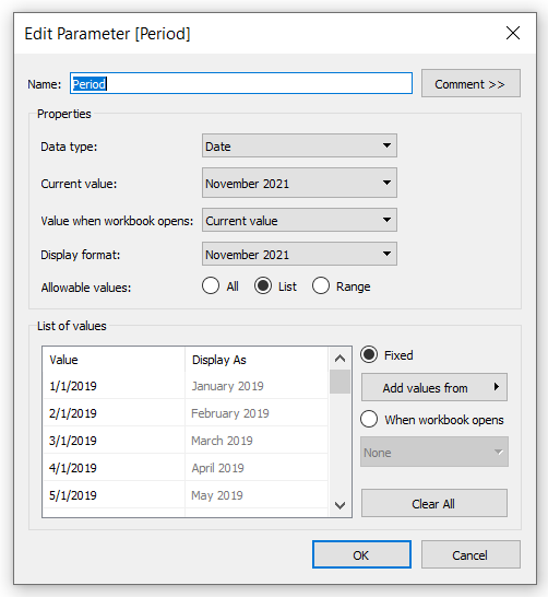
Parameters cannot be used as filters directly. Instead, you reference the parameter in a logical expression in a calculated field and place it in the filter container. Therefore, we could create a calculated field containing the expression DATE = PERIOD and filter for values for which this condition is met. The filter container is used to restrict the data of the entire worksheet accordingly.
The result for this worksheet would be the same as for the filter solution described earlier. We choose the "complicated" parameter solution here to ensure that all worksheets can be filtered using a single control element, rather than having two dropdown menus with different date values ( one for the parameter and another one for the usual date filter).
Self-Service Analytics with Tableau -
Download the whitepaper now!

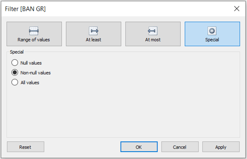
However, we go one step further for our KPI Tile: instead of restricting the data at the worksheet level, we filter at the field level. Doing so grants you more flexibility in choosing what information to display on the worksheet. This will come in handy later in this blog series.
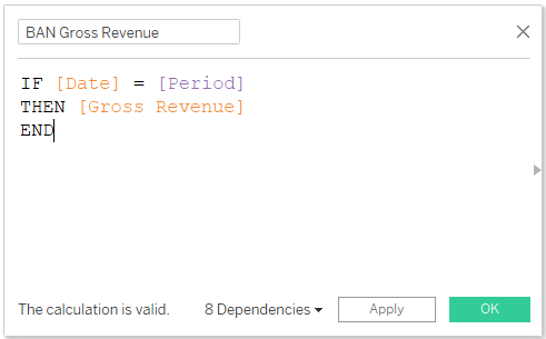
So how do you filter data at the field level? You need create a calculated field based on the key figure you want to display and add a condition to the formula that checks the DATE = PERIOD expression described earlier. This ensures that values are only displayed for the current parameter selection. Therefore, the zero values must be excluded from the view when doing so.
How does the current value contribute to the annual result?
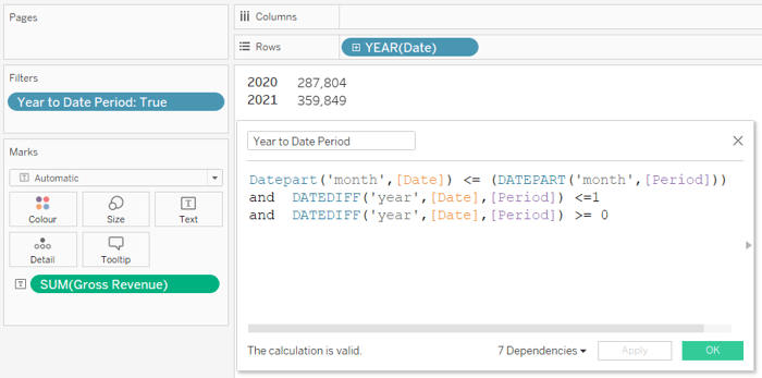
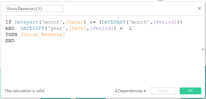
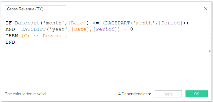
Since the core information of the KPI Tile is set up, we now want to investigate how the current value contributes to the annual result and whether the overall result at this point in time is higher or lower as it was last year. To do so, we switch to an empty worksheet where we perform Year-to-Date calculations. Year-to-Date means that all the monthly values up to the current month are summed up for the individual years, so that we can better assess the development over time. For the YtD calculations, we first create a table that aggregates each KPI by year. Here, we use the filter logic below to aggregate the data as required.
Datepart('month',[Date]) <= (DATEPART('month',[Period]))
and DATEDIFF('year',[Date],[Period]) <=1
and DATEDIFF('year',[Date],[Period]) >= 0
Next, we want to show the percentage change in the two YtD values in a new worksheet. Therefore, we first duplicate the worksheet containing the YTD values.We then proceed to set up a table calculation computing the percentage difference between the two values. Table calculations can be set up using the context menu of the KPI in the marks card.
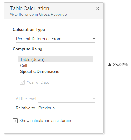
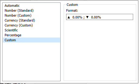
Afterwards, you can apply some formatting. In the formatting area, you can also define a custom number format in order to add a change indicator to the percentage value.
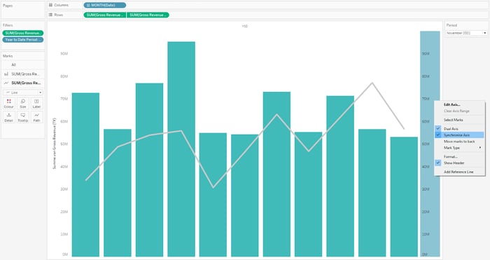
Displaying the development over time
Finally, we create a worksheet that shows the development of the KPI over time. Therefore, set up a combination chart in which the values of the current year are represented by bars and that of the previous year by lines. Since our view contains two different charts, we need a separate field for each of these charts. Therefore, we create a calculation containing the values up to the selected month of the current year and another calculation for the values of the previous year. The two metrics can then be compared using double axes in the view.
To add a second metric with a separate axis, drag the calculated field next to the first metric using the right mouse button. Then you can specify chart types and colors for the two metrics in the marks card. If you are working with dual axes, you must make sure that both axes use the same scale. Therefore, we synchronize the two axes using the secondary axis context menu.
What's next?
In today's blog article, we showed you how to create the individual components of the KPI Tile. In the following articles, we will show you how to combine these different worksheets into a single tile. Then, we will add interactive elements to the tile and add more charts to the dashboard, such as a waterfall chart.
Do you have questions about this or other topics? Then feel free to contact us! As Tableau partner, we are happy to advise you on all aspects of deployment, administration and best practices for effective Tableau Dashboards.