/Logo%202023%20final%20dunkelgrau.png?width=221&height=97&name=Logo%202023%20final%20dunkelgrau.png)


The holidays are over and we are looking ahead to 2024 full of confidence. While some of our colleagues are still busy with the end of the year, others are back from their winter vacation. For all those who want to immerse themselves in a little "SAC - What if...?" mind game, this article is for you. Grab a hot or cold beverage of your choice, it's time for the NextLytics wish list to the SAC for 2024!
Last year got the big Unified Story update, which we discussed in detail, as well as many medium and small improvements that shouldn't be swept under the Christmas table. More API commands, more analytical options, more performance - you could say "a bit of everything". Of course we are happy about the new features and improvements, but we are still far from happy. So at this point, we ask ourselves the question: "What if..."
"...input filters had more customization options"
The input filters are a central component in the control of dashboards and have become indispensable, as they are easy and intuitive to use. Unfortunately, their configurability is severely limited. What may still be fine for small stories becomes an ordeal for larger dashboards with multiple sources or special requirements. The Story 2.0 update has already extended the API commands and allows scripting to be attached directly to the input filter, but there is still a lot of open potential.
Display and change the data source of the input filter
It should be possible to check which data source the filter is linked to and to change the characteristic and data source.
Preload filter values in the background
Depending on the characteristic and the underlying data model, opening the filter can take quite a long time. This problem could be solved by loading the values in the background without affecting the overall performance.
Improved diagram view
Input filters react to and with each other. The diagram view displays the options one below the other. However, with several widgets and input filters, this quickly becomes confusing. The options for customizing the filters within the diagram are also limited. Selecting and deleting or creating several connections would make handling much easier.
More and stringent (design) options
Even though story filters and input filters look identical, the options are very different. Story filters cannot really be visually customized and therefore always stand out a little, if the provided style and design guidelines or the corporate identity of the company does not reley on the typical SAC "Light Blue". Input filters cannot process query variables and the design options do not include the expandable area or the filter checkboxes.
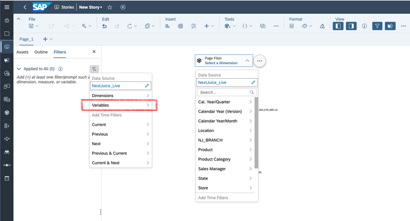
Unlike input filters, story filters can use variables.
With these small changes, input filters would be easier to use and customize, performance could be increased and response time could be reduced. It would also be easier to integrate input filters into the desired design of the story.
"...tables would have more design and display options"
Even though we clearly prefer charts for visualization, there are always scenarios in which the data is desired in table form. Basically, the table widget fulfills exactly this function, it displays data as a table. However, the cases for which a table is used are often more complex and push the table widget to its limits.
Various inChart options
Although it is possible to display key figures as a bar chart within the table, this is rather rudimentary. A real chart editor within the table would offer many possibilities here. In addition to various useful chart options such as sparklines, stacked, line or bar charts, it should also be possible to add further features to the chart. This would make it possible to capture distributions of characteristic values in one row at a glance.
Dashboarding with SAP Analytics Cloud -
Download the whitepaper here!

More smart design options
In principle, the design options are extensive, but unfortunately not particularly smart. It is certainly possible to highlight columns and underline rows or cells to improve readability and user guidance. As soon as the table adapts dynamically and a feature is added, removed or the position is moved, the previously defined visualization no longer fits. Here it would be helpful to link the formatting to the characteristics and characteristic values in the columns and rows.
With these small adjustments, tables could be used much more flexibly. Instead of simply displaying a large chunk of data, some aspects could be clearly visualized without bloating the table. Dynamic adjustments would also no longer shift the highlighted rows, columns or cells unnecessarily.
"...everything would be clearer, simpler and more refined"
The SAP Analytic Cloud is not a small tool and offers many possibilities. Even if you limit yourself to reporting, very few people use the full scope. This may be because you don't need all the functions for every scenario, but also because they may not be available depending on the scenario. The following sugesstions would be easy-to-implement and quality-of-life improvements, such as:
- Different symbols for classic and unified stories
- Change history within the story
- Uniform builder and styling panels
- Apply device preview settings in view mode
- Spacing and centering lines as well as size and behavior indicators when creating widgets
- Format transfer tool
- Uniform features regardless of the data source
As every year, we would also like to see more options in scripting and CSS. Here too, small changes would create great opportunities. Changing the chart type via script would avoid the need to create multiple widgets. It would also be useful to control the symbols, colors and limits for threshold values via API to make dashboards more dynamic, as the current solution with a combination of variables and calculated key figures is quite limited.
Unfortunately, nothing has changed in the CSS area in the past year. The possible adjustments are still very limited and many commands are missing or cannot be applied to some widgets, such as changing the checkbox colors in the input filter or filling certain bars in charts.
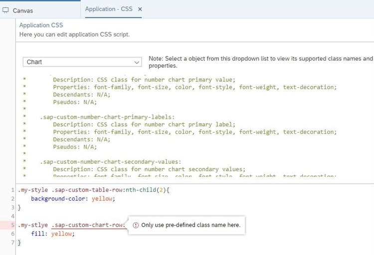
Although there have been many overall improvements in the past year,
no improvements have been made to the very limited CSS options.
"...if all wishes came true?"
Would we then be happy and satisfied with the SAC? The answer is most likely "no". Our digital world is in a constant state of flux and reporting needs are constantly changing. In contrast to the wish lists of recent years, this one is much more modest, with no major features or outstanding innovations. This is not due to our lack of creativity or the fact that SAP is already secretly working on one or two major topics. Of course, we could wish for a AI like ChatGPT within the SAC and this would not even be far-fetched. But instead of presenting big new gimmicks and implementing them half-baked, we should first adress the topics that pose challenges for users every day. The SAP Analytic Cloud is a good tool and would be even better if the existing functions were fine-tuned. The real challenges are intuitive operation with plenty of design freedom and good performance at runtime, with no ifs or buts. As soon as this is achieved, we can start dreaming about big and innovative topics such as "Dashboard creation with artificial intelligence" or "Live connections to SQL databases".
Do you have questions about this or other topics? Are you trying to build up the necessary know-how in your department or do you need support with a specific issue? We will be happy to help you. Request a non-binding consulting offer today.