/Logo%202023%20final%20dunkelgrau.png?width=221&height=97&name=Logo%202023%20final%20dunkelgrau.png)


With the Q4 2025 release of SAP Analytics Cloud (SAC) on November 15th, 2025, SAP delivers the last major update of the year and once again, similar to the latest release, puts a strong focus on design, usability and planning. A central element is the new Horizon theme, with which SAP takes the next step in its comprehensive UI redesign. The theme consistently follows the SAP Fiori design guidelines and provides a more modern, clear and consistent user experience.
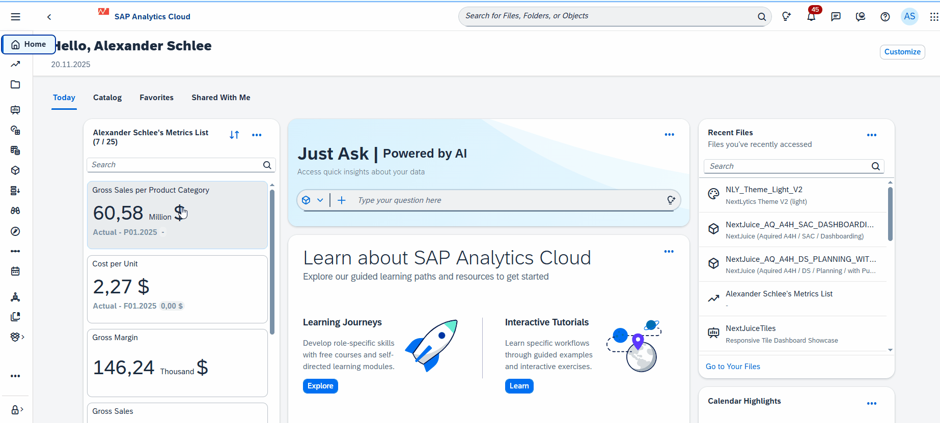
In addition, SAP is introducing My Metrics, a personal KPI dashboard that allows users to collect frequently needed metrics from different stories in one central place and organize them individually.
The release also extends the options for custom CSS, story branding and color design: with freely definable color palettes and enhanced styling options, corporate design requirements can now be implemented much more easily.
The release also delivers important progress in planning. Seamless Planning in particular benefits from improved live data integration and several quality-of-life updates that simplify the daily work of planners and modelers. We will cover this topic in more detail in a separate blog post.
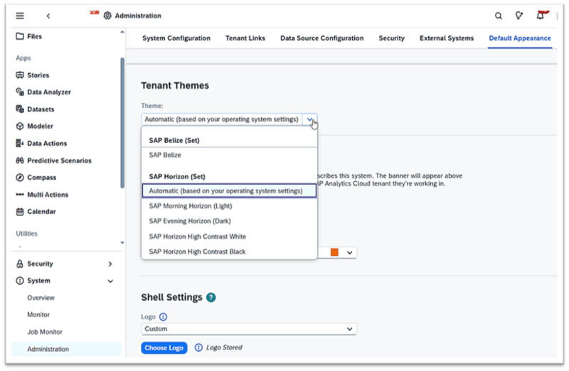
New Horizon Theme
With its SAP Fiori design strategy, SAP aims to provide a modern and consistent user experience across all SAP products and to keep the brand appearance uniform. With the Horizon theme, SAP is taking the next step and bringing the Fiori design to SAC in order to improve the look and feel here as well (users of Datasphere will recognize the new design). The theme uses a tonal color scheme to improve readability and contrast. This is intended to bring content and key actions more into focus and to enable a more accessible design.
When opening SAC, the Belize theme is still loaded by default (the new theme will become the default over the course of next year). However, users are informed about the new Horizon theme and can activate it directly in the settings. The “Evening Horizon” (dark) variant will likely be especially welcomed, as it finally provides a fully-fledged dark mode. In addition, “Morning Horizon” (light) is available as the bright standard theme, alongside “High Contrast White” and “High Contrast Black” for maximum accessibility. The Horizon design family thus covers a wide range of working styles and requirements - from clear, bright displays to dark, high-contrast surfaces and strongly contrasted, inclusive themes for better accessibility.
The Horizon theme can be activated both individually and centrally. Users can adjust the setting directly in their profile, while administrators can roll out the theme change system-wide for all users.
Additional adjustments:
• Improved user profile
The user profile has been redesigned and streamlined so that important informations are easier to access. For example, system information can now be displayed directly via the profile icon.
• Convenient search and optimized navigation bar
The search has been extended with auto-complete. This makes it easier to search for both objects and users. However, the auto-complete is still not optimal, as it returns all results related to the input. Searches therefore still need to be formulated quite specifically - but overall, it is a helpful improvement.
The side navigation bar has also been revised and improved, both structurally and functionally. Content is now clearly organized by apps and functions, making orientation noticeably easier. Although the changes may not seem significant at a first glance, the new structure helps to make navigation clearer and faster to use.
A practical addition in the compact view is the ability to hover over any icon to see its module name, ensuring users can navigate efficiently even when space is tight.
Dashboarding with SAP Analytics Cloud -
Download the Whitepaper here!
My Metrics in SAP Analytics Cloud: A Central Place for Your Key KPIs
In the updated navigation bar, you will now also find one of the key new features introduced with this update: My Metrics. The underlying concept already existed under the name “Watchlist”. As it was unfamiliar to most users and not easy to locate, SAP fully reworked and noticeably enhanced the feature.
My Metrics now appears in second position in the navigation bar and can be built individually by each user. Personal or team-shared metric lists can also be displayed directly on the SAC home page.
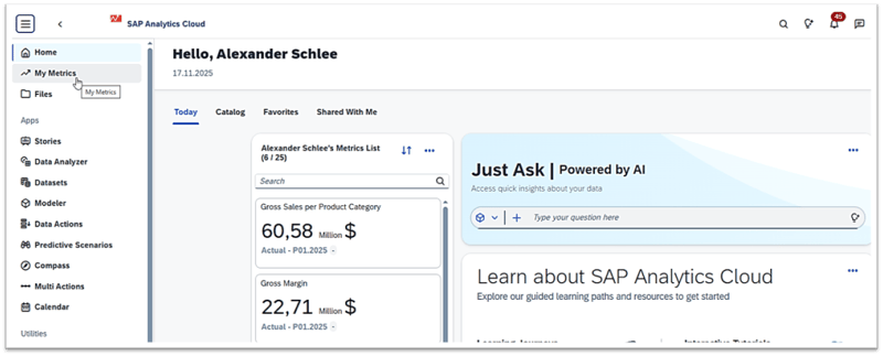
A key advantage of My Metrics is that important KPIs are quickly accessible without having to open several stories or create a dedicated dashboard. KPIs can be added to the personal list via right-click directly from a story, which makes building a compact overview much easier. At the same time, the interplay between My Metrics and the underlying stories is a clear plus, via the context menu of a metric tile, users can jump back to the original story at any time. If the KPIs are not modeled too complexly, Smart Insights can also be used to trigger a short automatic analysis.
However, despite this ease of access, My Metrics remains functionally quite limited. The application offers only few options for customization, and more complex scenarios can hardly be implemented. Advanced filter options, dynamic controls or interactive elements are missing. Based on the same data models, experienced SAC developers can create significantly more powerful dashboards with custom scripting, flexible filters, responsive layouts and a level of visualization depth that My Metrics currently cannot reach.
My Metrics is therefore best suited for a quick, personal overview of selected KPIs. For deeper analysis, cross-functional steering or demanding reporting scenarios, a fully-fledged story dashboard remains the better choice.
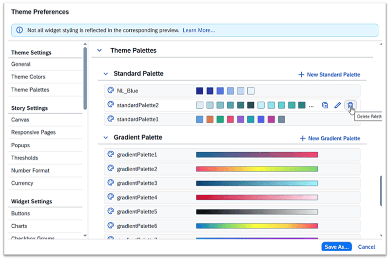
Custom CSS and New Palettes
Many CSS developers will welcome the introduction of enhanced color palettes and the new combo box for custom CSS. These changes have been requested for a long time, as comparable capabilities have been standard in other BI and design tools for years.
The extended color palette features make it possible to define custom color schemes for stories and remove unnecessary standard palettes. This helps avoid inconsistencies and ensures that corporate design guidelines can be implemented more reliably across multiple stories, all without extensive CSS scripting. Designers can also assign a unique ID and description to each palette, which simplifies management and reuse.
Palette management is located in the story options under Format → Design → Create Design. Here, users can adjust all relevant design elements - from typography colors to chart-specific palettes such as waterfall colors. The resulting configurations can then be saved as templates and reused in other stories.
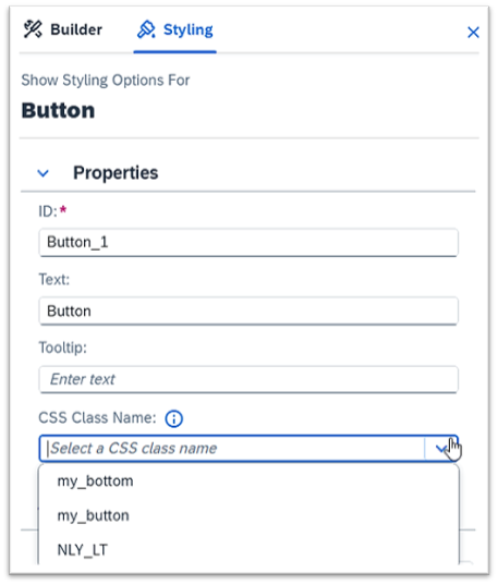
The new combo box ensures that all predefined custom CSS classes are visible directly in the styling panel. Previously, these classes had to be typed manually, which was error-prone and inconvenient. Now, when creating a new button, for example, it is enough to open the CSS dropdown to see a list of all available classes.
Further Updates: Important Story Adjustments for More Efficient Analysis
There are also several customer care updates for stories. Below, we briefly highlight the most relevant enhancements and new features from our perspective.
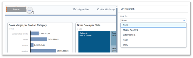
• Creating hyperlinks in stories and new pop-up behavior
One change in the Q4 update affects how hyperlinks are handled. Previously, story and external links had to be defined via button scripting (e.g. using NavigationUtils.openStory or NavigationUtils.openHyperlink), which could require additional adjustment efforts after transports between systems. With the new release, hyperlinks or stories can now be assigned directly via the button’s context menu. This removes the need for scripting and makes link maintenance clearer and easier.
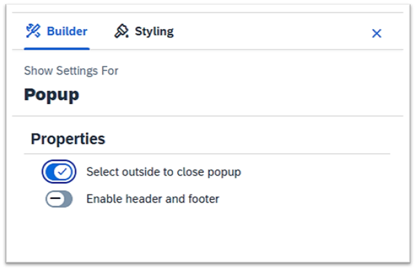
Another small but useful improvement concerns pop-ups: closing a pop-up by clicking outside the window can now be activated directly in the builder settings, without scripting. This makes configuration simpler and more transparent.
• New APIs and Data Analyzer short link
The update also brings additional APIs. For charts, new scripting functions are available to change variance settings via script. The URL API now supports additional operators such as in, between or greaterEqual, allowing variables to be set more precisely when calling a story. An additional API has been introduced that allows the Data Analyzer to be opened directly with a predefined layout from within a story. This can be triggered using openDataAnalyzer for a table or chart.
The Data Analyzer also receives an extra export function. When exporting to Excel, an optional shortcut link can now be generated and stored on a separate sheet. This link references the structure used in the Analyzer and the applied filters. It is also possible to decide whether the data should be exported with the number formats used in the Analyzer (e.g. currency symbols or percentages) or as pure numeric values without formatting.
Seamless Planning with Live Versions and Direct Datasphere Integration
With the Q4 update, SAP introduces one of the most important features for Seamless Planning: live versions in planning models with direct connectivity to SAP Datasphere views. SAC planning models can now access operational Datasphere data for the first time without any upload processes. Fact data is available live at all times, eliminating redundancy and significantly simplifying overall data management.
The new flexibility when integrating external versions is especially noteworthy: the underlying Datasphere view does not have to match the structure of the SAC model exactly. SAC automatically detects dimension and measure fields, reconciles certain data type differences and dynamically assigns missing members. This means that heterogeneous or differently modeled views can be integrated without major effort.
Combined with automatic model generation from Datasphere sources, this creates a coherent overall package. Once the reuse of Datasphere dimensions and write enablement via transformation flows become available, the Seamless Planning integration between SAC and Datasphere will be almost complete.
This topic is significantly deeper and has both architectural and process implications, a separate, detailed blog post will follow shortly.
SAC Q4 Release: Our Conclusion
The Q4 release brings a series of meaningful improvements. The new Horizon theme in particular stands out: it makes SAP Analytics Cloud clearer, more modern and noticeably more user-friendly, while aligning it better with the design language of other SAP cloud applications. With the introduction of color palettes and extended design options, users finally receive practical tools to align dashboards consistently with their corporate design - a long-standing request.
How intensively My Metrics will be used in day-to-day work remains to be seen. The feature provides a quick KPI overview but is still somewhat limited and will likely benefit from further enhancements to make it more flexible and comprehensive.
Overall, the Q4 update delivers a solid evolution that closes important usability gaps while paving the way for more substantial innovations. In particular, the progress around Seamless Planning and live data integration with SAP Datasphere marks a clear step forward.
Do you have questions about SAP Analytics Cloud or another topic? Reach out to one of our experts for a non-binding consulation.