/Logo%202023%20final%20dunkelgrau.png?width=221&height=97&name=Logo%202023%20final%20dunkelgrau.png)


The first SAP Analytics Cloud update of 2026 is here and as usual, it’s less about one “big bang” feature and more about a bunch of improvements that make day-to-day work smoother. The Q1 2026 release (also referred to as 2026 QRC1) rolled out in mid-February 2026.
In this post, we would like to focus on the highlights that tend to have real impact: better KPI overview, several story design upgrades (like new chart types and versioning), planning improvements, Compass enhancements, and new admin cards.
General Improvements in SACs Q1 2026 release
Subscribe to My Metrics Report (metrics to your inbox)
If you’re using My Metrics as a lightweight KPI hub, Q1 2026 adds a feature that makes it much more useful in practice: you can subscribe to a metrics report and receive it on a schedule. In other words, instead of actively checking KPIs, you can have SAC push a curated update to you (and to stakeholders who don’t live in dashboards all day).
This sounds small, but it closes a real gap: many teams use stories for operational reporting, yet executives often prefer “just send me the numbers regularly”. A scheduled metrics report fits nicely into that workflow, especially when the KPI set is stable and the goal is monitoring, not exploration. Also the subscription closes a feature gap between My Metrics and the old Data Change Insights.
From the SAC home screen, open My Metrics, select your metrics list and choose Subscribe to Metrics Report. SAC then guides you through a simple 3-step wizard:
(1) General Information to name the subscription and add an optional description, (2) Schedule to define how often it should be sent, and (3) Distribution List to specify who receives the report.
Once saved, the metrics update is delivered automatically based on the schedule.
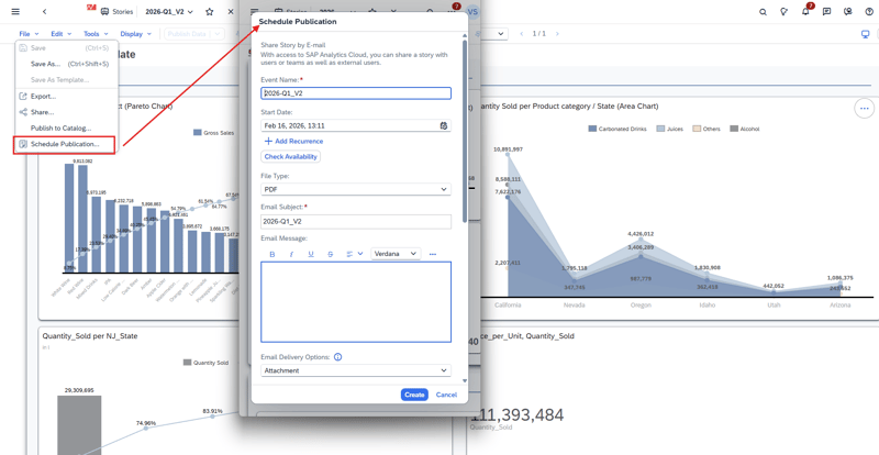
Scheduling Stories based on SAP Datasphere Live Connections
Scheduling in SAC has always been pretty straightforward when your story runs on imported data. Live connections are a different story because the data stays in the source system and scheduling often depends on a few extra technical prerequisites.
With the Q1 2026 release, SAC takes a nice step forward: you can now schedule stories that are based on SAP Datasphere live connections . That means you can stick to a “data stays in Datasphere” approach, while still distributing story outputs automatically without building workarounds or switching to imports just for scheduling.
This is particularly useful for the usual reporting routines:
-
daily operational snapshots
-
weekly stakeholder updates
-
month-end reporting packs
Dashboarding with SAP Analytics Cloud -
Download the Whitepaper here!
SAC Stories (Design & Collaboration)
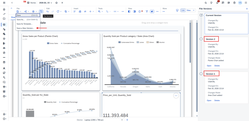
Create File Versions for Stories
File Versions is one of those features that quietly makes story development much safer. With Q1 2026, you can now save and manage different versions of a story. Older versions can be opened in read-only mode, which is handy if you want to review changes without accidentally editing something.
The best part is the restore workflow: if a story takes a wrong turn (or a “quick change” turns into a mess), you can simply pick an earlier version and restore it. That restored version becomes the new current version for editing which is a big improvement for teams collaborating on the same content, and for anyone who wants a lightweight safety net without exporting copies of stories. But keep in mind that this is a backup feature, it does not enable multiple developers to work on the same story at the same time. It is also not possible to merge specific parts of the version into the current actual version.
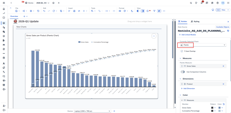
Create Pareto Charts
Pareto charts are now available in SAC stories, which is great when you want to highlight the classic “few contributors drive most of the impact” pattern (top customers, top products, main cost drivers, etc.). Instead of building a workaround with multiple charts and manual sorting, you can now use a dedicated chart type that’s easier to read and explain.
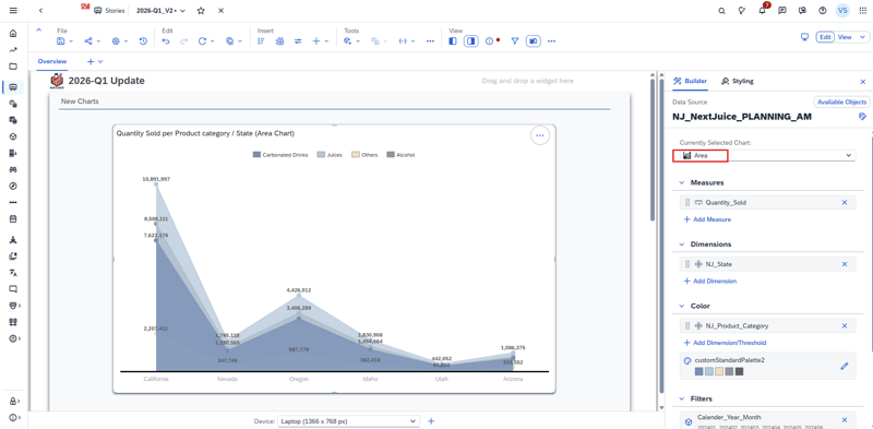
Create Area Charts (Optimized Experience)
Area charts are also now available for stories using the Optimized Design Experience. They’re especially useful when you want to visualize trends over time while emphasizing volume (for example: revenue over months, headcount evolution, consumption trends).
Show Sign as Arrows (↑ / ↓) for Numeric Formatting (New Table Build Experience)
If you’re using the new table build experience, you can now format positive and negative values using ↑ / ↓ arrows. It’s a small visual improvement, but it makes tables easier to scan especially for variance columns, delta measures, and calculations.
This formatting is available via the Show Sign As dropdown for measures and calculations, and works across all data models.
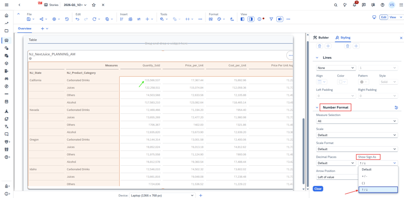
To apply it, select your table and switch to the Styling panel. Then click the numeric column you want to format (a measure or calculation) so the column-specific settings appear. Under Number Format, open Show Sign As and choose Arrows (↑ / ↓). Once enabled, SAC automatically displays an arrow next to each value , up for positive and down for negative which makes variance and delta columns much easier to scan at a glance.
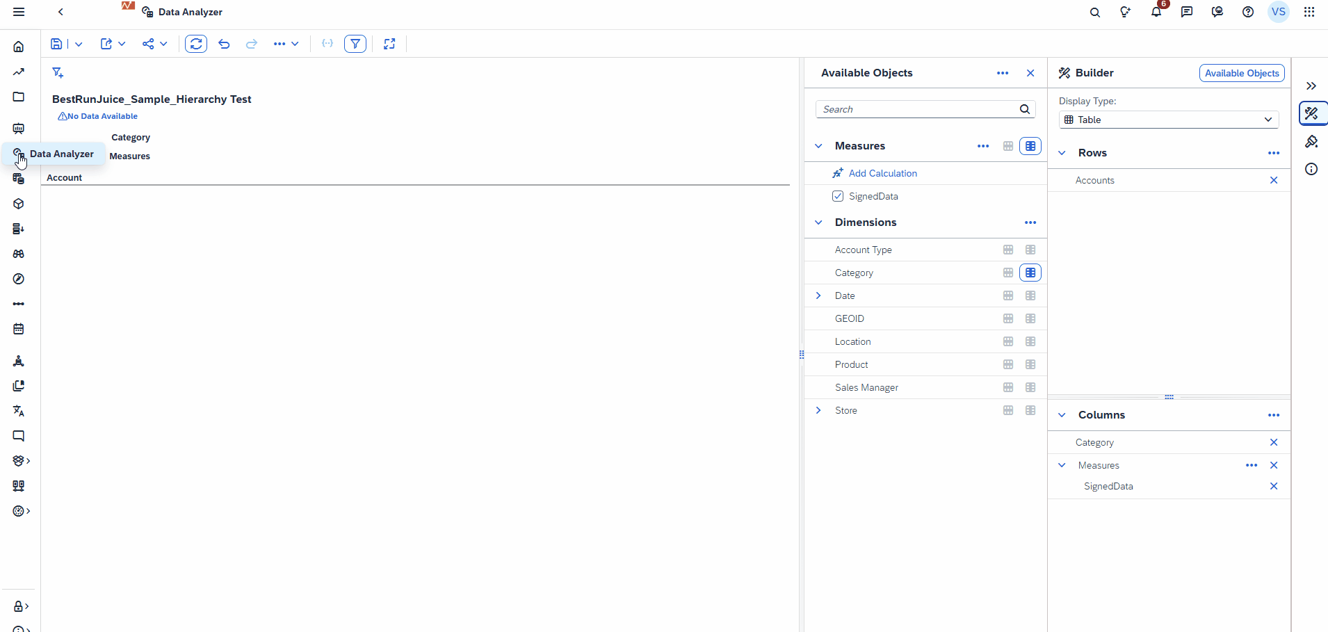
Data Analyzer
Data Analyzer keeps getting more “analyst-friendly” in Q1 2026 - when building formulas in the Calculation Editor, you can now use COUNTDIMENSIONS, which makes it easier to create dynamic calculations that react to the structure of your analysis (for example, checking how many dimensions are currently in the drilldown).
On top of that, SAP adds several new functions to the Add Calculation / Edit Calculation dialog, which reduces the need to export data or jump back into modelling just to do small transformations:
-
TOTEXT (not available for SAP BW model type) – helpful when you need to convert values for display or string logic.
-
LOWERCASE / UPPERCASE (not available for SAP BW model type) – simple, but very useful for cleaning up labels and comparisons.
-
ACCOUNTLOOKUP / MEASURELOOKUP (only for standard model type) – enables more advanced cross-references within your analysis, similar to “lookups” many planners/analysts expect.
-
RESTRICT – makes it easier to define calculations on a filtered slice (for example: a measure restricted to a specific member or condition).
A nice bonus: the AI-assisted calculation experience has been updated to support these functions as well.
SAC Planning
AI-assisted Data Action documentation (less tribal knowledge)
Data Actions are powerful but they also tend to become “tribal knowledge” over time. A script that made perfect sense during implementation can be much harder to understand six months later, especially when multiple people maintain the same planning model.
With Q1 2026, SAC introduces AI-assisted documentation for Data Actions, helping you generate and maintain descriptions for your logic more easily. It won’t replace good naming conventions and clean scripting, but it does make it quicker to keep Data Actions understandable , which is usually where projects start to struggle after go-live.
Where it helps most: handovers, multi-developer projects, and long-lived planning applications where Data Actions keep evolving.
Synchronous mode for Data Actions (better UX for quick runs)
If you’ve built planning stories for business users, you’ve probably seen the same pattern: users trigger a Data Action, and then wonder whether it actually ran, whether it’s still running, or where to check the status.
Q1 2026 adds a synchronous execution mode for Data Actions, intended for short-running operations. The idea is simple: for lightweight actions, SAC can run them in a more “direct” way: click, wait a moment, see the result instead of sending the user into an asynchronous background job flow.
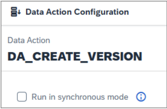
Why it matters: it reduces confusion and makes planning interactions feel more responsive, especially for validation steps, small allocations, or quick adjustments.
Practical note: this is not meant to replace async execution for heavier Data Actions. If the logic takes time or touches a lot of data, async still makes more sense.
Fact Deletion Step (faster than scripting)
Until now, deleting planning data in SAC often meant writing a script step in a Data Action which works, but can be slow and harder to maintain. With Q1 2026, SAP introduces a dedicated Fact Deletion step that you can add directly to a Data Action. The big advantage: it’s simpler to configure and typically much faster than doing the same job through custom script logic.
Within the step Options, you can choose between three delete modes depending on what you want to achieve:
-
Delete Facts: removes the facts that match your filters.
-
Delete Zeros from Facts: removes only the filtered facts where the value is 0.
-
Set Facts to Zero: keeps the record but sets the filtered facts to 0 (useful when you want to “reset” without deleting the record entirely).
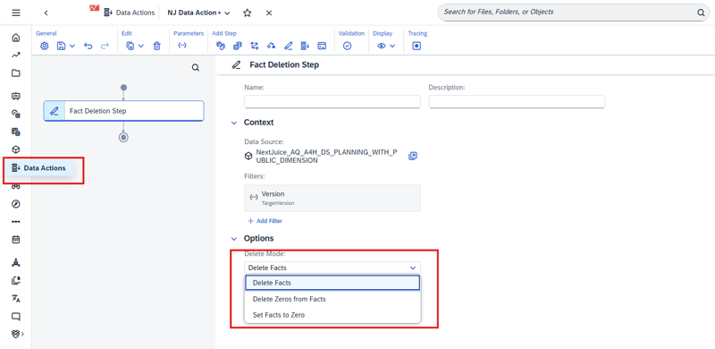
In practice, this makes common planning housekeeping tasks (resetting versions, clearing specific slices, cleaning up zero-records) easier to build and easier for others to understand later.
SAC Compass
AVG support improvements
Compass is getting more useful for “real” scenario work in Q1 2026. One of the most practical enhancements is that SAP extended the driver concept in SAC Compass. Previously, only additive key figures (SUM aggregation with standard disaggregation) could be used as drivers in simulations.
Compass now supports drivers based on average exception aggregation (e.g. AVG excl. NULL and AVG incl. unbooked), enabling simulations to work with rate-type KPIs in a natural way instead of forcing them into additive structures.
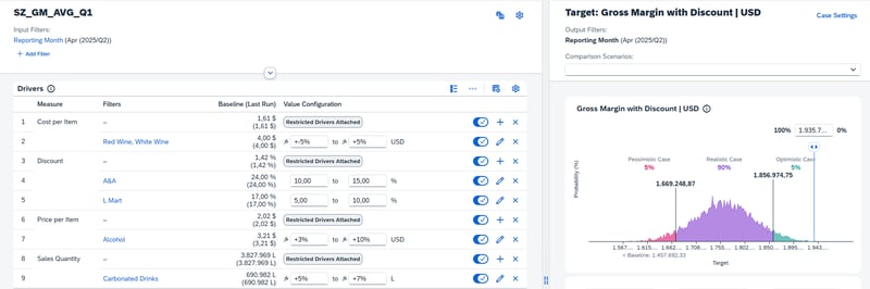
Why it matters: many important planning KPIs are rate-based (e.g. price per unit, discount rate, cost per contract or consumption per customer) and therefore modeled using average-type exception aggregation. As they are not additive, they previously could not be used as drivers without redesigning the model or building technical workarounds.
Nice side note: this enhancement addresses an SAP Influence request submitted by NextLytics regarding broader key figure support for Compass drivers.
System Administration
In many SAC landscapes, admin work is less about “big tasks” and more about small checks: tenant status, usage numbers, and the occasional performance investigation. With Q1 2026, SAP adds new administrator cards on the SAC Home Screen, bringing the most important admin entry points right to the place you start.
The cards are only visible for users with administrative roles and are meant to make monitoring and housekeeping quicker-fewer clicks drives into a faster overview.
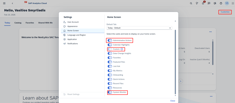
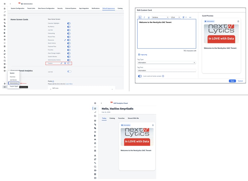
Custom Home Card
The Custom Home Card is exactly what it sounds like: a fully configurable card that admins can design in a rich text editor. You can:
-
add formatted content (guidelines, links, quick instructions),
-
upload an image (useful for banners or visual hints),
-
choose a tag type,
-
lock the card on the home screen so it appears for all users.
System Monitor Home Card
The System Monitor Home Card gives admins a quick overview of system usage and adoption indicators, such as:
-
license usage,
-
content overview,
-
and legacy content usage information.
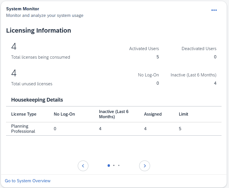
Instead of hunting through menus, you get a fast “at a glance” entry point to spot trends early (e.g., license utilization changes, content growth, or the ongoing cleanup of legacy objects).
Administrative Actions Home Card
The Administrative Actions Home Card is focused on alerts and items that need attention especially the kind of topics that can impact performance. SAP positions it as a way to identify and resolve performance-impacting queries more quickly.
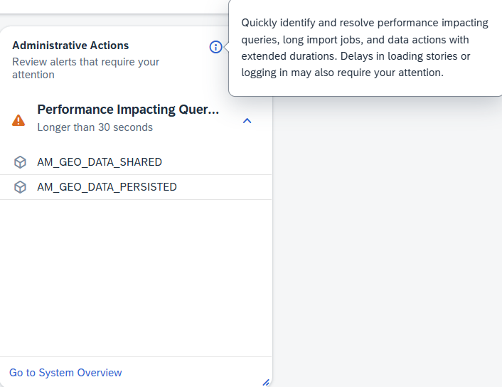
This supports a more proactive admin workflow: fewer surprises, faster reaction when something starts causing load, and clearer visibility of “what needs action” without digging through multiple admin screens.
SAC 2026 Q1 Release: Our Conclusion
Overall, the SAC Q1 2026 release is a good example of SAP focusing on the details that improve everyday usage rather than introducing one single feature. There are clear wins for multiple audiences: admins get faster visibility directly on the home screen, planning teams benefit from smoother Data Action handling (including faster fact deletion and synchronous execution), and story builders get practical design and collaboration upgrades such as new chart types, better table formatting, and file versions.
If we had to pick the changes that will be felt most quickly in projects, they would be the File Versions for Stories , the Fact Deletion step (because it simplifies and speeds up a common planning task), and the expanded scheduling support for Datasphere live stories (because it removes a typical “live vs import” trade-off).
Do you have questions about this or other topics? Are you trying to build up the necessary know-how in your department or do you need support with a specific question? We are happy to help you. Request a non-binding consulting offer today.