/Logo%202023%20final%20dunkelgrau.png?width=221&height=97&name=Logo%202023%20final%20dunkelgrau.png)




















With the Q3 2026 release, SAP continues to enhance Analytics Cloud across several areas. One of the most noticeable developments is the growing use of artificial intelligence. Story Code Generation is intended to support the development of stories with AI, while Prompt Insights brings generative AI directly into the dashboard. At the same time, there are also several interesting enhancements beyond AI. Especially in Planning, SAP is improving existing workflows, for example by enabling more flexible filter handling for Data Actions and by integrating Compass more closely into stories. In addition, the release introduces new chart types, improvements to Data Analyzer and My Metrics, as well as further progress toward the new Table Build Experience.
Not every new feature is equally relevant, in practice, and some still have noticeable limitations. We therefore took a closer look at the most important changes in the Q3 2026 release and highlight which of them can provide real value in day-to-day SAP Analytics Cloud (SAC) use.
AI-Assisted Features: How Story Code Generation & Prompt Insights Transform SAC
Story Code Generation
Let’s start with the new AI capabilities. One of the most promising additions in the Q3 2026 release is Story Code Generation, which brings AI-assisted scripting directly into SAP Analytics Cloud.
The basic idea is simple: the Story designer describes in natural language what behavior should be implemented within a Story. Based on this description, a specialized AI component generates the appropriate script code and subsequently validates it. Especially for recurring or technically manageable tasks, this can significantly simplify and accelerate story development. What makes the feature particularly interesting is its specialization. Unlike a general-purpose AI assistant, the underlying model is designed around structured knowledge of the SAC Scripting API. In other words, the generated code is intended to reflect the specific capabilities and constraints of SAC Stories rather than simply producing generic JavaScript.
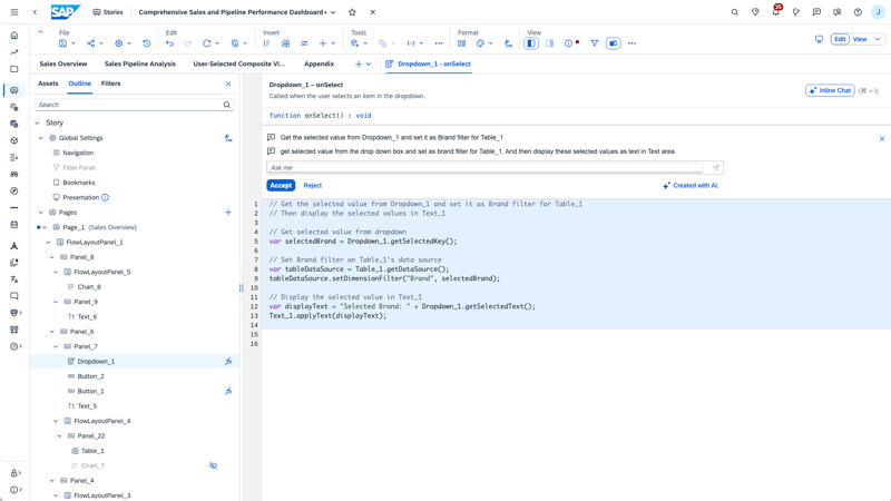
Source: https://discovery-center.cloud.sap/ai-feature/6f863dc0-f047-4120-b632-99aa12b58484/
How reliably this works in more complex real-world scenarios remains to be seen. Large stories often contain dependencies between widgets, custom interaction logic, and sophisticated planning workflows. It will be particularly interesting to see how well the AI understands the overall context and whether the generated code works reliably in practice. SAP primarily presents Story Code Generation as a way to make Story Scripting more accessible. The goal is to enable business users to implement more logic themselves without requiring extensive programming knowledge. SAP mentions potential use cases such as controlling widgets, dynamically filtering charts and tables, and automating planning processes, for example by triggering Data Actions or locking planning data.
To use the new feature, the corresponding permissions must be assigned in SAP Analytics Cloud. The required permissions are Execute for Generative AI and Create for Applications. One point that is currently somewhat confusing is SAP’s own documentation. The SAP Help page for AI-Assisted Features in SAP Analytics Cloud still lists a purchased SAP AI Units license as a prerequisite. For Story Code Generation, however, this requirement does not appear to apply, or the documentation may no longer be up to date. SAP classifies the feature as a Base AI feature, meaning that its use does not consume additional AI Units.
In practice, this means that Story Code Generation should be available within an existing SAP Analytics Cloud license, as long as the technical prerequisites are in place and the necessary permissions have been granted
Prompt Insights
Prompt Insights takes the AI concept one step further than Story Code Generation. Instead of only assisting during development, AI becomes an actual part of the finished dashboard.
The setup is relatively straightforward. The story designer adds a Prompt Insights widget and connects it to an existing table or chart. The data shown in that widget, combined with a custom prompt, provides the context for the AI-generated analysis. The feature can work with both tables and charts, regardless of the underlying data source. Users can also choose between a faster response mode and a more comprehensive analysis that takes longer to process.
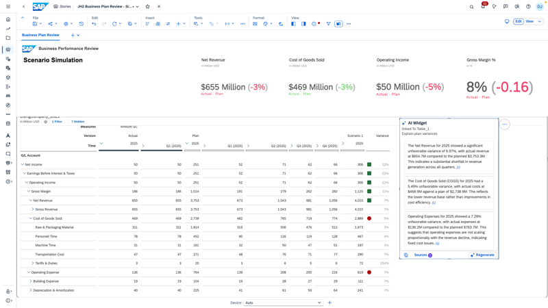
Source: https://discovery-center.cloud.sap/ai-feature/95d0b6d9-803f-4597-a749-f3a6cd25b12e/
The biggest limitation is the scope of the available context. Prompt Insights only sees the data contained in the linked widget. It does not independently explore the underlying model or retrieve additional information from it. Variances and calculated measures can be taken into account as long as their values are part of the connected widget. Presentation logic such as thresholds, on the other hand, is not automatically interpreted as business context and should be described in the prompt where necessary. This means that the quality of the output depends to a large extent on how well the story designer prepares the context. The AI can interpret the data it is given, but it does not build a broader semantic understanding of the data model on its own. A well-structured dashboard and careful selection of the relevant context therefore remain essential.
From a governance perspective, SAP uses controlled access to the LLM and automatically masks certain personally identifiable information. The language model used for Prompt Insights is defined by SAP as part of the SAC feature. Users cannot freely select a model or connect their own LLM. At the same time, the data required for the analysis is still sent to the underlying LLM provider. Since not every sensitive or confidential value is guaranteed to be detected and masked, and web search may optionally bring external sources into the analysis, organizations with strict privacy or compliance requirements should carefully evaluate which data they expose and which analysis options they enable.
Overall, Prompt Insights is an interesting feature because SAP is not simply adding a generic chatbot to the story. The designer remains in control of what data the AI sees and how it is instructed to analyze it. In practice, the quality of the results will therefore depend less on the LLM alone and more on the relevance, quality, and structure of the context provided.
SAC Planning Updates: Optimizing Data Actions & Delta Processing with Data Filter Parameters
Dynamic Filters for Data Actions
Passing story context into Data Actions has traditionally been one of the less elegant parts of SAC Planning. Users can set filters and input controls in a story, but the underlying calculation does not automatically inherit that context. This often leads to numerous individual parameters, workarounds for dynamic filtering, and calculations that process far more data than they actually need.
The new Data Filter Parameter addresses exactly this issue. It allows multiple story filters and input controls to be passed to Data Actions and Multi Actions in a single parameter. This also includes dynamic time filters, exclusions, and attribute-based filters. Because one parameter can cover multiple dimensions, it can replace much of the parameter logic that previously had to be built manually. SAP is also extending the concept beyond standard Data Action steps. Advanced Formula steps can now work with the transferred filter context as well, so filter logic defined in the story no longer has to be recreated inside the formula.
Particularly interesting is the Version Changes Filter, which builds on this concept. Instead of taking the filter context exclusively from the Story, SAC automatically identifies which areas of a public edit version or private version have been changed and passes exactly this context to the Data Filter Parameter. If, for example, a planner changes values for two cost centers, the subsequent Data Action can process only those affected areas. Especially in interactive planning scenarios, this can reduce runtimes and system load.
However, this delta-based processing is not suitable for every calculation. If an allocation or distribution requires the full dataset, restricting the calculation to the most recently changed records would produce an incorrect business result. The Version Changes Filter is therefore a useful extension of the Data Filter Parameter, but it is deliberately a tool for suitable use cases rather than an automatic optimization for every Data Action.
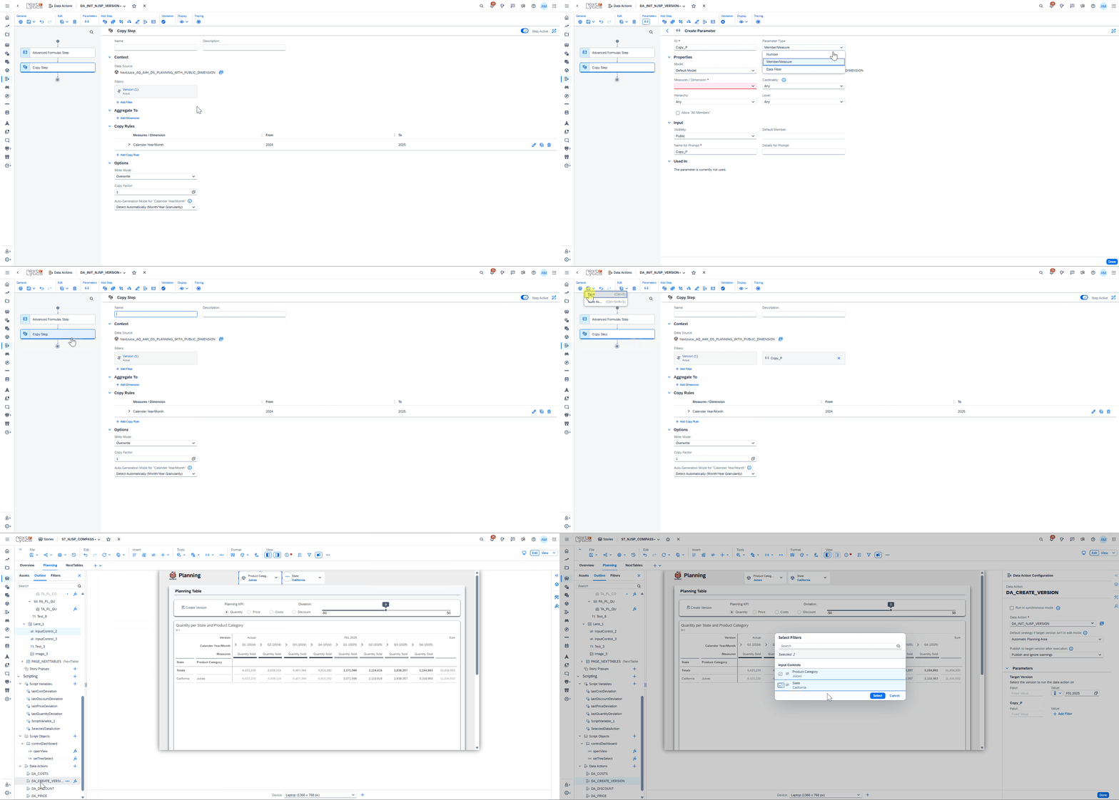
The use of filter parameters in Advanced Formulas is somewhat more specific. Here, filter parameters must be enabled using CONFIG.DATA_FILTER_PARAMETERS, while the relevant dimensions must additionally be specified using CONFIG.DATA_FILTER_DIMENSIONS. Unlike with other step types, the transferred dimensions are therefore not taken into account automatically. If these dimensions are also used in DATA(), DELETE(), or RESULTLOOKUP, CONFIG.HIERARCHY may also need to be configured.
Overall, this is a very practical improvement for more complex planning applications. Data Actions can be linked more cleanly to the actual Story context while also becoming more flexible and reusable.
Dashboarding with SAP Analytics Cloud - Download the whitepaper here!
Predictive Simulations & Dynamic Analytics: Integrating Compass Widgets and Data Analyzer
Compass as a Widget Directly in the Story
So far, Compass has existed as a separate module within SAP Analytics Cloud. With the new release, SAP is bringing it directly into SAC Stories, making it much easier to embed simulations into existing planning and analysis workflows.
The simulation itself is still created and configured in the Compass module. Published scenarios can then be used in a story through the new Compass widget. The widget displays simulation results either as an interactive result chart, a three-case view, or a combination of both. If a driver value in the underlying model changes, the widget detects the change and can offer a new simulation run without requiring the user to leave the story.
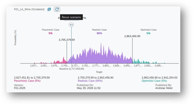
The integration is further enhanced by Smart Boundaries. This feature helps define realistic upper and lower limits for driver fluctuations. Instead of setting these boundaries entirely manually, historical values can be analyzed using predictive time-series methods. This is particularly interesting because defining realistic ranges of uncertainty is often one of the most subjective parts of a simulation. Smart Boundaries does not replace business judgment, but it provides a data-based and therefore more transparent starting point.
The individual steps can also be connected through the Story APIs loadSimulationResults(), validateSimulationResults(), and rerunScenarios(). For example, after a Data Action has been executed, the story can check whether relevant drivers have changed and then trigger a new simulation.
One practical limitation remains when it comes to visualization. Each widget can only use one target measure. As soon as multiple KPIs need to be viewed or compared together, this can restrict the design of more complex dashboards.
Overall, the integration brings Compass much closer to everyday use. Because Risk simulations no longer have to be treated as a separate type of analysis but can instead be integrated directly into the environments where planning and forecasting decisions are already being discussed.
We were able to test the new Compass widget ahead of the release and see the overall direction of development as a positive step. At the same time, some limitations remain. Currently, only public scenarios can be displayed in the widget. This means that not only the results become visible, but also the driver configurations and the baseline data from the latest simulation run. Especially when working with sensitive assumptions, it is therefore important to carefully consider who should have access to these scenarios. Some of the points we already discussed in our detailed article on SAP Analytics Cloud Compass also remain unresolved. It will therefore be interesting to see how SAP continues to develop Compass in the upcoming releases.
Data Analyzer & My Metrics
Data Analyzer and My Metrics also receive several practical improvements with the new update, primarily aimed at simplifying existing workflows.
One of the most interesting changes in Data Analyzer concerns navigation from a Story. Dynamic time filters now remain dynamic instead of being converted into fixed values when Data Analyzer is opened. Supported filters include Story-, page-, and widget-level filters, as well as BW fiscal dimensions, Restricted Dimensions, and structures. Particularly for relative periods such as the current period, this ensures that the analysis remains consistent with the original Story. Saved Insights are becoming more flexible as well. They can now be saved without predefined mandatory variable values, meaning that each user makes the required selections only when opening the Insight. Data Analyzer tables also support external hyperlinks on dimension members, making it possible to link directly to additional information or external source systems.
My Metrics receives similar usability improvements. Existing metrics can now be adjusted after creation, including their filters, variances, and display settings, without having to recreate them from scratch.
There is one important limitation to keep in mind. If a metric is part of a subscription, changing its filter context can remove previously recorded values. My Metrics links also open in Lite Viewer by default, although users can still switch to Full Viewer when required.
The preservation of dynamic filters is particularly useful because it prevents relative time periods from unintentionally becoming static when switching to Data Analyzer. The other changes are more incremental usability improvements, but they should still make existing workflows easier.
Widgets: New SAC Visualizations
New Chart Types: Sankey, Funnel and Gauge Charts
SAP is expanding SAC with three new visualization types: Sankey, Gauge, and Funnel Charts. Until now, similar visualizations often required combined charts, additional helper measures, or Custom Widgets. The three chart types come with a total of seven variants, each designed for different analytical scenarios.
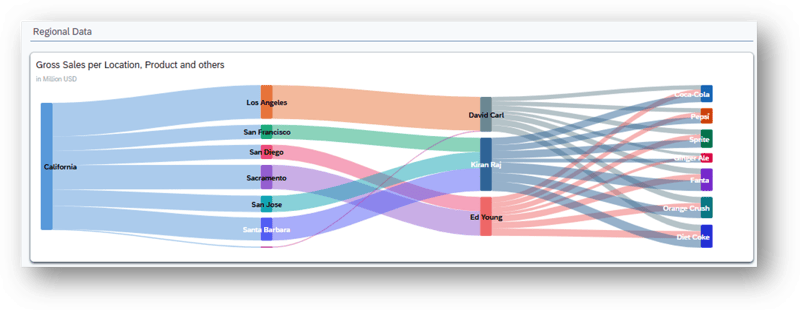
Sankey Charts are used to visualize flows across up to five stages. One variant supports account hierarchies, making it possible to present, for example, a profit and loss statement as a flow diagram. The color logic is similar to that of waterfall charts: positive accounts are displayed in green, negative accounts in red, and dimensional groupings in gray. Another Sankey variant shows how a measure is distributed across multiple dimensions and process stages.
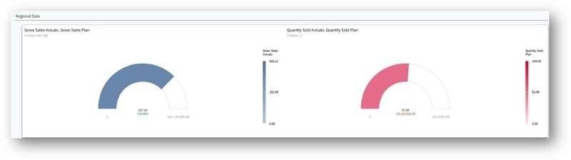
Gauge Charts come in three different variants. They can show a measure against predefined threshold ranges, compare it with a target value, or visualize version comparisons in planning models, such as actual versus plan.
Funnel Charts show not only the conversion rate relative to the first stage, but also the so-called Stage Rate, which represents the change compared with the previous stage.

However, the new visualizations are not entirely without limitations. Sankey Charts currently do not support SAP BW models and are limited to a maximum of five stages, 15 nodes per stage, and 75 nodes in total. For larger structures, data must therefore be filtered or aggregated accordingly. For Gauge Charts, attention should be paid to the overshoot property. If it is disabled, the scale ends at the target value, and any overperformance is no longer directly visible. As for Funnel Charts, the Stage Rate is currently only displayed in the tooltip and cannot be permanently shown directly on the chart.
Overall, the new chart types are a useful addition to SAC’s visualization capabilities, although not all of them are equally relevant for day-to-day use. Gauge Charts are probably the easiest to integrate into operational dashboards, especially for quickly evaluating individual KPIs against target or threshold values. For comparisons and trends over time, however, other chart types will usually remain more informative. Funnel Charts are more specialized. They work best for clearly defined process or conversion stages, such as leads, opportunities, and closed deals. Outside of these scenarios, especially for general KPI comparisons or time-based analysis, their use is rather limited. For Sankey Charts, the lack of support for SAP BW models and the current limits on stages and nodes restrict their use considerably. In our test, the chart could be created and displayed without issues in edit mode, but the finished dashboard repeatedly returned a “Failed to fetch data” error, even after significantly reducing the amount of data.
Other Updates
Improved Search and Filter Selection
With the Q3 2026 release, SAP is revising the search behavior within filters and aligning it more closely with the interaction logic familiar from Excel. Two new options, Replace and Update, make it easier to manage selections. Replace swaps the current selection for the latest search result, while Update adds the new matches to the existing selection. In addition, matching values are now preselected automatically, eliminating the need to manually deselect “All” in many cases. The new logic is intended to be available for Story, page, and widget filters, making larger or gradually built filter selections much more convenient.
This is not a feature that fundamentally changes SAC, but it is a useful improvement in detail. Especially users who frequently work with extensive filter lists should be able to save some time and unnecessary clicks in everyday use.
New Table Build Experience as the New Standard
The New Table Build Experience is also being expanded further and is increasingly becoming the central table interface in SAC. For wide tables, SAP is improving performance through lazy loading for columns. When a table is opened, only the visible columns are loaded initially, while additional content is rendered only when users scroll horizontally. Especially for very wide planning and analysis tables, the initial display has often been a performance issue. Going forward, SAC will first render only the visible columns and load the remaining ones as needed. This may sound like a relatively small technical optimization, but it can noticeably improve perceived performance in everyday use. It is important to note, however, that lazy loading primarily optimizes frontend rendering. Slow BW or HANA queries will not become faster as a result.
The Excel export also receives a small enhancement. With the new Format “as True Value Type” option allows numbers, dates, currencies, and percentages to be exported as native Excel data types while preserving the formatting defined in SAC.
For Story designers, usability is improving as well. Dimensions and measures can now be dragged and dropped directly from the Data Panel into tables, replaced, or reordered. At the same time, the active version filter becomes more visible and is now also shown in the context menu and in the table subtitle.
None of these changes is a major headline feature on its own, but together they make the new table experience faster, clearer, and more pleasant to work with. For projects that still depend heavily on the legacy table interface, the case for switching is becoming stronger.
Modeling and Data Integration
Finally, let us take a look at modeling and data integration, where the Q3 2026 release also introduces several useful enhancements. One noteworthy addition is the new support for import connections to SAP HANA Cloud. HANA Cloud databases can now be connected directly to SAC, including TLS certificate validation via JDBC. Unlike on-premise connections, neither the SAP Analytics Cloud Agent nor the Cloud Connector is required. Data loads and replications into SAC are still supported to the same extent.
Another change that many users will likely appreciate is the standardization of master data imports. Public dimensions now use the same Data Wrangler that is already available for transactional data and model creation. Existing import jobs can also be edited retrospectively instead of having to be recreated entirely when configurations change or errors occur. A small improvement, but one that has been overdue for quite some time in our view.
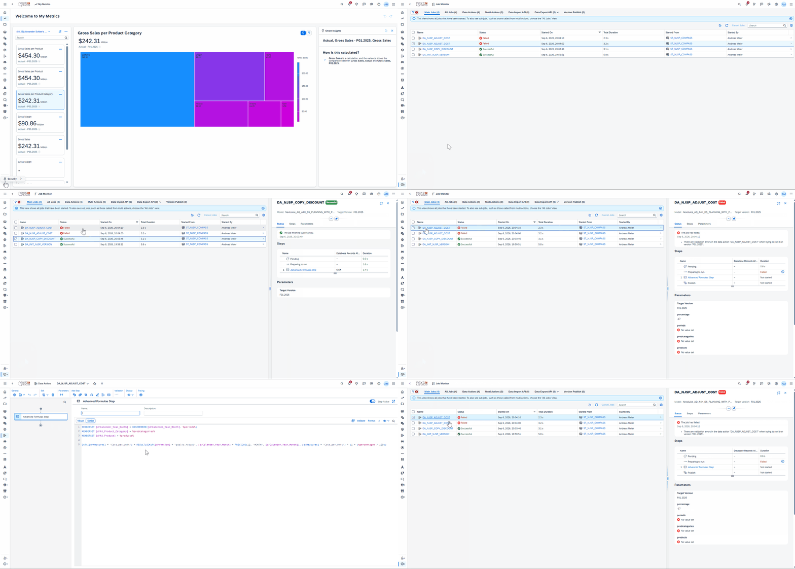
There is also more transparency around job monitoring. With the Embedded Job Monitor, planners and Story users can track the status of Data Actions and Multi Actions directly within the Story instead of switching to the separate monitor. Users with the appropriate administrative permissions can also view additional or all jobs. Data Import API jobs are now included in the central Job Monitor as well. In addition, users can navigate directly from a model to the related import and export jobs. Together, these changes make monitoring both business planning activities and technical data-loading processes more convenient.
Discontinuation of Legacy Interfaces and New Story Permissions
One change that should not go unnoticed is the retirement of several legacy SAC interfaces. With QRC3, SAP is drawing a final line under Classic Stories and Analytic Applications, making the move to the Optimized Story Experience effectively mandatory. The legacy Home Screen is also being removed completely, so users will only have access to the new start page going forward.
At the same time, Story permission management is becoming more granular. In custom roles, permissions for creating, reading, editing, deleting, and sharing Stories can now be assigned or removed individually. SAP also provides greater transparency into which Story permissions are included in the standard roles. From a governance perspective, this is a sensible improvement because it allows Story creation and pure consumption to be separated more clearly. Organizations should, however, review their role configurations after the update and, where necessary, update internal training materials to reflect the new interface.
SAP Analytics Cloud Q3 2026 release: Our Conclusion
The SAP Analytics Cloud Q3 2026 release is not defined by one major technological breakthrough. Instead, it combines a number of new ideas with many practical refinements to existing functionality. Planning is one of the areas that benefits most, with several previously awkward workflows becoming much easier to handle. The new Data Filter Parameter is a good example: it may sound relatively minor, but in more complex planning applications it can simplify implementation considerably. The closer integration of Compass into Stories follows the same direction by bringing simulation much closer to the actual planning and analysis workflow.
The new AI capabilities will probably attract the most attention nevertheless. Story Code Generation has the potential to significantly lower the barrier to entry for Story Scripting and is particularly interesting because it is specifically designed around the SAC Scripting API. It is also positive that the feature is available as a Base AI capability without consuming additional AI Units. How well it performs in more complex Stories, with dependencies between widgets or sophisticated planning scenarios, however, still needs to be proven in practice. Prompt Insights provides another indication of where SAP is heading with Analytics Cloud. Its potential is clear, but expectations should be kept realistic. The quality of the generated insights depends heavily on the context made available to the AI and on how carefully the Story, data, and prompts are designed. Privacy and governance considerations will also need to be addressed before organizations use the feature at scale. Another feature many users have probably been waiting for is lazy loading for table columns. Especially in very wide tables, this can noticeably improve the initial display because only the visible columns are rendered first. The picture is similarly mixed when it comes to the new visualizations. Sankey, Funnel, and Gauge Charts do fill gaps in SAC’s standard visualization portfolio, but limitations such as the lack of BW support for Sankey Charts also show that not every new feature is immediately suitable for every existing SAC scenario.
Overall, Q3 2026 feels like a release in which SAP is consistently evolving many different building blocks of SAC. Some of the less visible enhancements may actually deliver noticeable value in day-to-day project work faster than the prominently marketed features. The new AI capabilities, on the other hand, offer significantly greater potential, but are also more difficult to assess at this stage. It will therefore be particularly interesting to see whether SAP develops them in the coming releases to the point where they move from interesting standalone tools to an established part of everyday work with SAC.
Are you currently evaluating how these new features fit into your roadmap, or do you need tailored guidance on implementing SAP Analytics Cloud in your active projects? Feel free to reach out to our team of experts for direct support.